Productivity
9 min read
Law Firm Website Design: What High-Value Clients Actually Look For
Written By:
iWebDsign Team
Date:
June 18, 2026
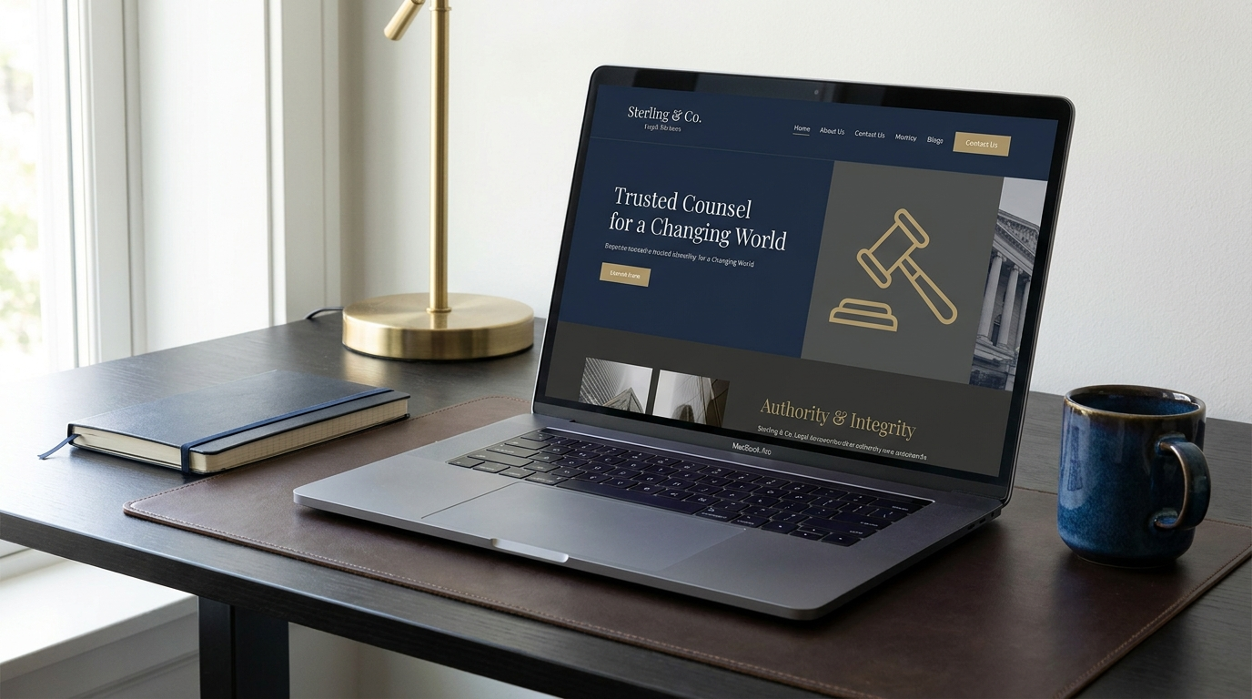
Law Firm Website Design: What High-Value Clients Actually Look For
By iWebDsign Team | 22 June 2026 | 16 min read
When a prospective client needs a lawyer for a high-stakes matter — a complex business dispute, a serious injury claim, a sensitive family case — they rarely pick up the phone and dial the first name they remember. They open a browser, type a few words, and start judging. Within seconds, they have formed an opinion about whether your firm looks like the kind of practice that wins cases like theirs. That judgment happens long before they read a word about your experience, and it is shaped almost entirely by your law firm website design.
The uncomfortable truth for many firms is that their website actively works against them. It looks dated, loads slowly on a phone, buries the attorney bios three clicks deep, and asks the visitor to “Submit” through a generic contact form that feels more like a complaint box than an invitation to a confidential consultation. Meanwhile, the firm down the street with arguably less courtroom experience is booking the high-value matters simply because their digital presence signals competence, trust, and ease.
In this guide you will learn exactly what affluent, discerning clients evaluate when they land on a law firm website, why each of those signals matters, and how to design a site that converts qualified visitors into booked consultations. We will move from first impressions and trust architecture through practice-area structure, mobile experience, performance, ethics compliance, and the specific design decisions that separate a firm that looks expensive from one that looks like a bargain. By the end, you will have a practical framework you can use to audit your own site or brief a designer.
Table of Contents
- Why First Impressions Decide the Case
- The Trust Signals High-Value Clients Scan For
- Structuring Practice Areas So Clients Self-Select
- Attorney Bios That Build Authority and Rapport
- Mobile Experience and Site Speed
- Designing for Conversion Without Looking Desperate
- Ethics, Compliance, and Accessibility
- Content and SEO That Attract the Right Clients
- Frequently Asked Questions
- Conclusion
Why First Impressions Decide the Case
Legal services are what economists call a credence good: the buyer cannot fully evaluate the quality of the work even after it is delivered, let alone before. When someone cannot judge the substance directly, they lean heavily on proxies — and the most immediate proxy available is how your firm presents itself online. A polished, confident website becomes a stand-in for a polished, confident attorney.
Research from the Nielsen Norman Group and decades of usability studies consistently show that users form an aesthetic judgment of a website in well under a second, and that this snap judgment colors everything they read afterward. For a law firm, that means the visual quality of your homepage is not a vanity concern. It is the first piece of evidence in your favor, presented before you have said anything at all.
The cost of looking dated
Consider what a dated website silently communicates. Small, dense text suggests the firm has not updated its presence in years. Stock photography of gavels and marble columns signals that the firm did not invest in telling its own story. Broken links and a copyright date from three years ago imply nobody is paying attention to detail — a damaging inference for a profession built on precision. High-value clients, who often have the resources to hire whoever they want, read these cues fluently. They assume that a firm careless with its own website may be careless with their matter.
The compounding effect of confidence
The opposite is also true and far more useful. A clean, modern design with generous spacing, confident typography, and a clear point of view tells the visitor that this firm takes itself seriously and has the means to do things properly. That impression compounds. A visitor who arrives feeling reassured reads your attorney bios more charitably, trusts your case results more readily, and is more willing to share their contact details. The design does not just look better — it changes how every other element on the page is received. This is why investing in professional web design and development services tends to pay for itself through higher-quality leads rather than merely more of them.
Speed as a first impression
First impressions are not purely visual. A page that takes five seconds to render its hero image has already made an impression — a bad one — before the design even has a chance to work. We will return to performance in detail later, but it belongs in any honest conversation about first impressions, because for mobile visitors on a cellular connection, load time is the first impression.
The Trust Signals High-Value Clients Scan For
Once a visitor’s initial aesthetic judgment is positive, they begin hunting — often unconsciously — for concrete reasons to trust you. The firms that win high-value matters are the ones that surface these trust signals deliberately and early, rather than hiding them on an “About” page nobody visits. Think of trust as a series of small reassurances delivered in the right order.
Credentials, affiliations, and recognitions
Bar admissions, court certifications, peer-review ratings, and recognized industry listings function as third-party endorsements. A visitor cannot independently verify your trial skill, but they can recognize that an external body has vouched for you. Display these prominently, but tastefully — a quiet row of recognized credentials near the top of the homepage does more than a cluttered wall of badges. The American Bar Association maintains guidance on how lawyers may responsibly present their qualifications, and staying within those professional norms protects both your license and your credibility. You can review the relevant model rules and resources at the American Bar Association.
Results, told responsibly
Prospective clients with serious matters want evidence that you have handled situations like theirs. Case results, notable verdicts, and settlement figures are powerful — but they carry ethical weight. Most jurisdictions require disclaimers clarifying that past results do not guarantee future outcomes, and that every matter is fact-specific. Design these sections so the disclaimer is visible and the results are framed honestly. A firm that overstates outcomes looks desperate to the sophisticated client and risks discipline; a firm that presents results soberly looks confident and compliant.
Testimonials and human proof
Genuine client testimonials, where ethically permitted, add the emotional layer that statistics cannot. A short quote describing how the firm communicated clearly during a frightening time resonates with someone facing the same fear. Pair written testimonials with a real name and, where consent allows, a photo or video — anonymous five-star blurbs read as fabricated. Be mindful that some bar associations restrict client testimonials or require specific disclaimers, so confirm the rules in your jurisdiction before publishing.
Showing your work
Nothing builds confidence like demonstrating that you have done excellent work before. A well-organized portfolio of representative matters, redesigns, or client outcomes lets visitors see your capability rather than simply read claims about it. When we rebuilt a regional litigation practice’s digital presence, the single most-clicked element was the detailed case study — visitors wanted the narrative of a real engagement. You can see how we approach this kind of project in our LegalPDX website redesign, and browse the broader range of results in our portfolio.
Security and confidentiality cues
Legal matters are intensely private. Visible signals that your site is secure — HTTPS in the address bar, a clearly stated privacy policy, and a contact form that explains how their information will be handled — reassure visitors that reaching out will not expose them. A small line of copy near your intake form, such as “Your message is confidential and reviewed only by our attorneys,” can measurably increase form completions.
Structuring Practice Areas So Clients Self-Select
A common and costly mistake in law firm website design is treating practice areas as an afterthought — a flat list of one-word links in a dropdown. High-value clients arrive with a specific problem, and your site’s job is to help them quickly confirm, “Yes, this firm handles exactly my kind of matter.” When that confirmation comes fast and clearly, trust accelerates. When visitors have to dig, they leave.
Lead with the client’s problem, not your taxonomy
Lawyers tend to organize practice areas using internal terminology — “commercial litigation,” “fiduciary disputes,” “regulatory compliance.” Clients, however, search and think in terms of their situation: “my business partner is suing me,” “a contractor walked off the job,” “my elderly parent’s trust is being contested.” The most effective practice-area pages bridge that gap, using plain-language headlines that mirror the client’s problem and then introducing the precise legal term. This is both a usability decision and an SEO one, because it aligns your pages with how people actually search. Reference resources like FindLaw’s consumer legal guides illustrate how the public phrases legal problems, which can inform your own page language.
Give each practice area a dedicated, substantive page
A single “Practice Areas” page listing twelve specialties in two sentences each tells the client nothing and ranks for nothing. Each significant practice area deserves its own page that explains the kinds of matters you handle, your approach, the typical process a client can expect, representative outcomes, and a clear next step. These pages do double duty: they reassure the human reader and they give search engines a focused, authoritative document to rank for that specialty.
Help visitors navigate by situation
For multi-practice firms, consider a navigation aid that lets visitors self-select by scenario rather than by legal category. A simple “What can we help you with?” module with a handful of common situations routes people to the right page in one click. This reduces the cognitive burden on someone who is stressed and unfamiliar with legal jargon, and it dramatically improves the odds they reach a relevant page before bouncing.
Avoid the over-claim trap
It can be tempting to list every conceivable practice area to capture more searches. For a firm targeting high-value clients, this backfires. Affluent clients prize specialization; a boutique that clearly focuses on three things looks more authoritative than a generalist claiming fifteen. Let your site reflect genuine depth. If you are a litigation powerhouse, make litigation unmistakable rather than diluting the message with peripheral services you rarely handle.
Attorney Bios That Build Authority and Rapport
For most law firms, the attorney biography pages are among the most visited on the entire site — often second only to the homepage. This makes sense: clients are not hiring an abstract “firm,” they are hiring a person they will trust with something important. Yet bios are frequently the weakest part of a firm’s website design, reduced to a dry recitation of law schools and bar admissions. A great bio does two jobs at once: it establishes authority and it builds human rapport.
Open with substance, not chronology
Most bios begin with where the attorney went to school. Clients care about that eventually, but what they want first is whether this lawyer understands and can win their kind of case. Lead with a short, confident statement of focus — the types of matters the attorney handles and the results they are known for — then move into credentials and background. The reader’s most pressing question gets answered in the first sentence.
Show the human behind the credentials
High-stakes legal matters are emotional. Clients want a lawyer who is both formidable and approachable. A few genuine sentences about why an attorney practices in a particular area, what they value in client relationships, or how they communicate during a case make the person relatable without undermining their authority. Lawyerist and similar professional resources have long noted that the bios generating the most consultations balance gravitas with warmth — you can find ongoing practice-management perspectives at Lawyerist.
Photography matters more than you think
Professional, consistent headshots are non-negotiable for a firm courting high-value clients. Mismatched photos — some studio-lit, some clearly cropped from a phone — undercut the premium impression instantly. Beyond the headshot, consider environmental photography that shows attorneys in the office or in conversation, which feels more current and human than the rigid, arms-crossed pose. Consistency across all bios signals an organized, detail-oriented firm.
Make every bio a conversion point
A visitor reading an attorney’s bio is often at peak interest. Do not strand them there. Each bio should end with a clear, low-friction way to take the next step — a direct line to schedule a consultation with that attorney or the firm’s intake team. Forcing them to navigate back to a generic contact page loses momentum at the exact moment it matters most.
Mobile Experience and Site Speed
A substantial and growing share of legal searches happen on a phone, frequently at the moment a problem becomes urgent — after an accident, after receiving a demand letter, late at night when worry sets in. If your site is difficult to use or slow to load on mobile, you are losing exactly the high-intent visitors most likely to become valuable clients. Mobile experience is no longer a secondary consideration; for many firms it is the primary one.
Mobile-first, not mobile-tolerated
There is a meaningful difference between a site that technically works on mobile and one designed for mobile from the start. A mobile-first approach assumes the small screen is the default and ensures that the most important actions — calling the office, reading practice-area information, booking a consultation — are effortless with one thumb. Tap targets are large, text is legible without zooming, and the phone number is a tappable link rather than plain text. Google’s own guidance for developers emphasizes mobile usability as foundational, and you can review current best practices at Google Search Central.
Speed is a conversion and ranking factor
Page speed affects two things that both matter to your firm: how many visitors stay, and how well you rank in search. Studies repeatedly show that conversion rates fall sharply as load times climb past a few seconds, and search engines explicitly factor page experience into rankings. The largest culprits for slow legal sites are typically oversized images, bloated page builders, and too many third-party scripts. Addressing these is among the highest-return improvements you can make.
What a fast, focused mobile experience looks like
On a well-built mobile law firm site, the hero communicates who you help and offers an immediate way to make contact. Navigation is simplified to the essentials. Forms ask for only what is necessary to start a conversation. Nothing competes for attention with the primary action. The result is a visitor who can go from worried search to booked consultation in under a minute — which is precisely the experience that converts urgent, high-value matters before the prospect contacts another firm.
Test on real devices
Designers and firm owners often evaluate their site on a large desktop monitor and never experience what most clients do. Make a habit of opening your site on an actual phone over a cellular connection. Try to complete the core tasks — find a practice area, read a bio, submit an inquiry — and note every point of friction. That five-minute exercise reveals more than any analytics dashboard about where you are losing people.
Designing for Conversion Without Looking Desperate
The purpose of a law firm website is not to be admired; it is to turn the right visitors into consultations. But conversion design for a premium legal practice is a delicate art. The aggressive, pop-up-laden tactics that work for a discount retailer would repel a corporate general counsel or a high-net-worth individual. The goal is to make the next step obvious and easy while preserving the dignity and confidence that high-value clients expect.
One primary action per page
Every important page should have a single, clear primary action. On most law firm sites, that action is scheduling a consultation or contacting the firm. Competing buttons — “Subscribe,” “Download,” “Chat,” “Call,” all shouting at once — dilute focus and create decision paralysis. Choose the one step that matters most for that page and make it unmistakable, with supporting actions clearly secondary. When you are ready to map this out for your own firm, you can get in touch to discuss how a conversion-focused structure would apply to your practice.
Reduce friction in the intake form
Long contact forms kill conversions. Each additional field measurably lowers completion rates, and an intimidating form on a sensitive legal matter is especially likely to be abandoned. Ask only for what you genuinely need to begin a conversation — typically a name, a way to reach them, and a brief description of the matter. You can gather details later, by phone or in the consultation. Pair the form with reassuring copy about confidentiality and a realistic expectation of when they will hear back.
Make contacting you frictionless across the site
A high-intent visitor should never have to hunt for a way to reach you. A persistent, tasteful call-to-action in the header — and a tappable phone number on mobile — means the next step is always one click away regardless of where on the site the visitor’s interest peaks. The key word is tasteful: a quietly persistent invitation respects the reader, whereas an interruptive pop-up the moment they arrive feels cheap.
Design the consultation as an easy “yes”
Language and framing matter enormously. “Submit” is transactional and cold. “Request a confidential consultation” tells the visitor exactly what happens next and reassures them about privacy. Where appropriate, clarifying whether an initial consultation is complimentary removes a major hesitation. The objective is to lower the perceived risk and effort of that first step until saying yes feels natural rather than fraught.
Ethics, Compliance, and Accessibility
Law firm websites operate under constraints that most businesses never face. Attorney advertising rules, jurisdiction-specific disclaimers, and confidentiality obligations all shape what you can and cannot say. At the same time, accessibility law increasingly applies to websites, exposing firms to risk if their sites cannot be used by people with disabilities. Far from being mere obstacles, handling these well is itself a trust signal — it shows sophistication and care.
Attorney advertising and disclaimer rules
Every U.S. jurisdiction regulates lawyer advertising, and the specifics vary. Common requirements include disclaimers that prior results do not guarantee future outcomes, clarity that the site does not create an attorney-client relationship, and identification of the responsible attorney or firm. Build these into the design from the start — a clearly visible disclaimer in the footer and on results pages, written in readable text rather than hidden in microscopic gray type. The American Bar Association’s model rules provide a baseline, but you must follow your own state’s bar rules, which sometimes go further.
Avoiding inadvertent attorney-client relationships
A poorly designed contact form can create real exposure. If a visitor submits confidential details about their matter, your firm could face conflicts or duties you did not intend. Thoughtful design mitigates this with clear language near the form explaining that submitting an inquiry does not create an attorney-client relationship and that they should not send confidential or time-sensitive information until a relationship is established. This protects the firm while still inviting contact.
Accessibility is both law and good design
Web accessibility — ensuring people who use screen readers, keyboard navigation, or have low vision can use your site — is increasingly the subject of legal claims, and law firms make conspicuous targets. Beyond risk, accessible design is simply better design: sufficient color contrast, descriptive link text, proper heading structure, and keyboard-navigable menus help everyone. Meeting recognized standards such as WCAG also tends to improve SEO, because the same structural clarity that helps assistive technology helps search engines. A firm that ignores accessibility on its own website is not a good look when clients may be hiring it to protect their interests.
Privacy and data handling
With confidential inquiries flowing through your site, a clear and honest privacy policy is essential — and in some jurisdictions, legally required. Explain what data you collect, how it is used, and how it is protected. Ensure the entire site runs over HTTPS so that information submitted through forms is encrypted in transit. These are baseline expectations for any professional site, and their absence is a glaring red flag to the kind of client who reads the fine print.
Content and SEO That Attract the Right Clients
A beautiful website that no one finds generates no consultations. Search visibility is how high-value clients discover firms they were not already referred to, and the structure and content of your site largely determine whether you appear when it matters. The encouraging news is that the same decisions that make a site genuinely useful to clients also make it rank — good law firm website design and good SEO are aligned, not at odds.
Build authority around your specialties
Search engines reward depth on a topic. A firm with a substantive practice-area page supported by related articles answering the questions clients actually ask — “What should I do after a commercial lease dispute?” or “How long does a probate contest take?” — signals genuine expertise on that subject. This topic-cluster approach builds authority methodically and captures visitors at every stage, from early research to ready-to-hire. It is far more effective than a single thin page trying to rank for a competitive term on its own.
Write for the client, optimize for the engine
The best legal content reads as if a knowledgeable, generous attorney is explaining something clearly to a worried client. Naturally written, genuinely helpful content tends to include the phrases people search for, because it addresses real questions in plain language. Resist the temptation to stuff keywords; modern search engines reward clarity and helpfulness and penalize manipulation. Write the page you would want a family member to read if they faced this problem, then refine the structure for searchability.
Local relevance for local matters
Many high-value legal matters are still local — a client wants representation admitted in their jurisdiction and familiar with local courts. Ensuring your site clearly communicates where you practice, maintaining accurate listings, and creating location-relevant content all help you appear for the geographically specific searches that convert. For firms serving particular regions, this local signal is often the difference between visibility and obscurity.
Structure that search engines can read
Behind the scenes, technical structure matters: a logical hierarchy of pages, clean internal linking that connects related practice areas and articles, descriptive page titles, and fast, mobile-friendly delivery. This is where design and development meet SEO directly. A site architected thoughtfully from the start — rather than patched together over years — gives search engines a clear map of your expertise. If your current site has grown tangled, a structured rebuild focused on both clients and search is usually the highest-leverage investment, and it is exactly the kind of work our design and development team is built to deliver.
Frequently Asked Questions
How much should a law firm invest in website design?
Costs vary widely depending on the size of the firm, the number of practice areas and attorneys, the depth of content, and whether the site is custom-built or template-based. A serious, custom site designed to attract high-value clients is a meaningful investment, but the right frame is return rather than price: a single high-value matter won through the site can pay for the entire project many times over. The more useful question is not “What is the cheapest option?” but “What will it cost us in lost clients to keep the site we have?”
What is the most important element on a law firm website?
There is no single magic element, but if forced to choose, it is trust — established immediately through professional design and reinforced through credentials, results, testimonials, and clear, confidential pathways to contact the firm. Everything else, from practice-area structure to attorney bios, exists to build and protect that trust. A site can be visually stunning, but if it fails to make a worried visitor feel they are in capable, trustworthy hands, it will not convert.
How long does it take to design a law firm website?
A thoughtfully designed, content-rich law firm site typically takes several weeks to a few months from strategy through launch, depending on scope and how quickly content and approvals move. The strategy and content phases — defining positioning, writing substantive practice-area pages, gathering results and testimonials, and arranging professional photography — often take longer than the visual design itself. Rushing these foundational steps is the most common reason a site underperforms after launch.
Do law firm websites really need to worry about accessibility?
Yes. Website accessibility is increasingly the subject of legal claims, and law firms are visible, credible targets. Beyond legal exposure, accessible design reaches more potential clients and tends to improve search performance because the underlying structure is cleaner. Treating accessibility as a core requirement rather than an afterthought is both prudent risk management and simply better design.
Can a great website replace referrals?
A strong website complements referrals rather than replacing them. When a referred prospect looks you up — and almost all of them do — a confident, professional site confirms the referral and removes doubt. For prospects who find you through search, the site is the referral. The two channels reinforce each other: referrals send people to your door, and your site closes the impression.
Conclusion
High-value clients judge law firms the way they judge everything else — quickly, on the available evidence, and with little patience for friction. Your website is the first and often the deciding piece of that evidence. The firms that win the best matters are not necessarily the ones with the most courtroom hours; they are frequently the ones whose digital presence signals competence, builds trust deliberately, makes the right information effortless to find, and turns interest into a confidential consultation without friction.
Everything in this guide reduces to a simple principle: design every element of your site to answer the worried, discerning visitor’s unspoken questions — Can this firm handle my kind of problem? Can I trust these people? Is it easy to take the next step? When the answer to all three is an immediate and confident yes, you have a website that earns the high-value clients your expertise deserves. Get the first impression, the trust signals, the practice-area clarity, the attorney bios, the mobile speed, the conversion paths, the compliance, and the SEO right, and the site stops being a brochure and becomes your most reliable source of qualified matters.
Ready to take the next step? View Our Work to see how we help professional firms turn their websites into client-winning assets.
iWebDsign Team
06-18-2026
Ready to evolve?
Let's build a digital experience that drives real growth for your brand.
Let's Get In TouchTop Reads
Explore More